Tag Archives: fashion and culture

OFF THE CUFF: The Politics of Pants — Part I

23 Feb

“He who has pants, has freedom” – France, 1800s

In a spring season where menswear-inspired trousers have become a focal point of the collections and women are unequivocally ‘wearing the pants’ again in fashion, it seems appropriate to examine the impact that the trouser has had throughout history.

It seems strange to think that such a basic item of clothing can create so much turmoil — yet in 3,000-plus years of recorded human history, pants have only been considered acceptable public attire for women for the past 40.  Never in the annals of fashion has a specific garment been the object of so much ridicule, debate and polarized opinion.

Originally the mode of dress for both sexes was based on a sarong-like skirt or toga-like gown.  Over time, of course, cultures evolved and societies flourished.  The advent of more refined textiles and complex tailoring techniques paralleled this evolution, and a decidedly class- and gender-based code of acceptable dress came about.

The first fledgling appearances of women in trousers began in Europe around 1800 to the great dismay of the male ruling class.  In the misogynistic society that pervaded Europe at that time it was felt that, if women were allowed the freedom of menswear, what other emancipations would be desired next?

For much of the following century the concept of pants for women was regularly introduced and subsequently denounced as utterly unacceptable:

1800 — Around this first appearance of women in ‘men’s attire,’ an ordinance was immediately added to the Napoleonic Code in France that “all women desiring to dress like men would have to present themselves before the prefecture of police to obtain authorization to do so.”

"Off to Battle" -- Caricature, France, 1848


1851 — Amelia Jenks Bloomer, a suffragette pioneer and author of the feminist journal The Lily, began crusading against the tyrannies of the corset with the ‘anti-crinolinist’ movement in the United States.  She designed and wore a pair of long, full bouffant pants ( later called ‘Bloomers’ ) that were fitted at the waist and ankles.  Not surprisingly, the subsequent scandal that ensued lent the garment little support.  Many openly expressed that controversial apparel such as this should be reserved for those women – rebels, hygienists and feminists – who simply did not keep ‘acceptable’ company.


Bloomer in Her Namesake

1911 — Paul Poiret, one of the greatest and most forward-thinking couturiers in Paris, presented a series of sketches entitled “Four Ways to Dress Women in Pants” and introduced the ‘harem skirt’ – a long tunic with very full gathered pants of the same material underneath.  Several other couturiers began to experiment with the skirt-pant concept as daywear, prompting the Vatican to vehemently denounce the concept of women in trousers, describing it as “immoral in the extreme.”

It was not until the early 1920s that women en masse began to view the viability of trousers.  Vitality and activity, sports and resort travel became an integral part of any society woman’s life, and she must have the wardrobe to accompany it.  Parisian couturiers, acceding to their client’s demands, began to create sport, resort and après-ski pant ensembles – enabling a new generation of women to participate in sports activities as never before.

Jeanne Lanvin Ski Ensemble -- Mid-1920s

Though the trouser was still relegated to the shores or the slopes, these changes were not without impetus.  The winning of the long-fought suffragette movement, the upheaval of World War I, and later the introduction of jazz and its accompanying passions afforded women an entirely new view of their position in society – with it came garment choices seen not just as a form of attraction, but a statement of solidarity.

Corsets and complicated layers were, slowly but definitively, being relegated to the past.  To spend the weekend in an easy resort ensemble and then be expected to return home to the complexities of the corset was no longer feasible.  Women had had their ‘place’ in society, and their mode of dress had assisted them in this.  It was time for change – complex layers, bindings and accouterments were replaced with softer fitting, less constricting designs.

For so many women of this period the resort trouser represented both rebellion and emancipation – not only a release from the physical restraints of corsetry but from the broader, more ethereal constricts of morality that those garments represented.

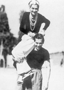
Indeed, it was Chanel’s intense dislike of this concept of ‘women-as-ornaments’ as much as her desire for practicality that provided the momentum for her easily elegant designs.  She was one of the

Chanel & Serge Lifar, Deauville, France -- 1937

first to unashamedly don trousers while on holiday — not because they seemed stylish, but because they were comfortable .  Her creations , along with those of contemporaries like Patou and Lanvin, ushered in a new era that trumped the bound and corseted shapes of the time to eventually become the de rigueur silhouette of the era.

Styles remained predominantly unchallenged over the next decade, with pants continuing to appear on the fringes of sport and society.  It was not until the advent of World War II and its repercussions that trousers finally began to appear in every woman’s wardrobe…


…CONTINUED NEXT WEEK

Advertisement

HUE CLUE — The Psychology of Color – Part II

24 Jan

“There is no model, there is only color.”
— Paul Cezanne

Our response to color is as unique as it is universal, as relevant to our cultural heritage as it is to our own very personal experiences.  Because it creates a mood, color can have a chameleonic effect to the viewer.  A man in a blue sweater tends to come across as easygoing and personable.  Change that color to red and that same individual will be viewed as more challenging, less friendly, even arrogant.  Yet we associate that same red with passion and sensuality.  A woman at a party in a black cocktail dress is seen as chic, urbane and slightly mysterious.  That same woman in a red dress is, to the same observer, perceived as more powerful, sensual and sexually desirable.

The most complex response we have to color, however, comes from our own personal experiences.  Since external stimuli have tremendous impact on our senses, this has nothing to do with what is sent down the runway.  Because color is so evocative to our psyche, we tend to relate specific tones or combinations of tones to an event or period in our past.  This, above all else, seems to irrevocably affect how we relate to certain colors, positively or negatively, for the rest of our lives.

I truly loathe the combination of black and light pink – and I know the reason why.

Before I began working in the fashion industry I was a theater and dance major and attended college to study both.  As a freshman I was required to study the fundamentals of ballet.  The classes were occupied by a number of young women – quite serious in their studies – who were always dressed the same way: black leotard with pale pink tights, or pale pink leotard with black tights, plus matching leg warmers and pink satin toe shoes.

These classes were also ridiculously overcrowded and lacked the proper supervision – consequently by the end of my first semester I had injured myself to the point that I had to withdraw from school entirely in order to recuperate.  To this day, any time I come upon black and light pink, I actually feel physical pain – a purely psychosomatic response, but one that will forever affect my perception of those colors.

I would love to know what colors you, the reader, are fond of or, conversely, which hues you find hideous – and more importantly, why??  (The fascinating thing is that, almost always, the combination of the two tones – the one you love and the one you hate, work off of each other beautifully.  Interesting, no?)

“I’m not that interested in fashion… When someone says that lime-green is the new black for this season, you just want to tell them to get a life.”
Bruce Oldfield

I’m actually very fond of these bright, pure tones for Spring/Summer 2011.  They have a clarity that transmits a certain vitality and energy, a hopefulness, that is much needed right now.  At the same time there is an audacity to these colors that, while appealing on the page, is likely to be difficult for many women to be comfortable interpreting.

In a volatile economy where consumers are especially cautious about purchases and consider every new garment an ‘investment piece’, it’s difficult to imagine a nearly-neon pink trouser or lemon yellow ankle-length halter jumpsuit a viable purchase.

These are pieces that can be frustratingly limited in their lifespan – recognizable garments that, because of their tonality, are particularly memorable the first time worn and are consequently difficult to integrate with one’s existing wardrobe or reinterpret to seem fresh and new.  This poses a problem to any individuals with a limited budget who, frankly, are the overwhelming majority of consumers.

This isn’t to say that you should keep it dark and somber all summer – it’s simply a question of what to invest in.  It’s important to remember that runway and reality are two very different things.  With this in mind, there are three basic factors to remember when investing in color for Spring/Summer: Quality, Shade, and Placement.

Quality is of utmost importance when working with bold hues – inexpensive synthetics and inferior workmanship are far more obvious in a bright color, where every stitch and seam is easier to see than in a dark or neutral.  Additionally, quality fabrics dye more richly than their substandard counterparts.  Wools and silks, particularly in gabardine or crepe, not only take color deeply but move beautifully on the body.

Shade is equally important.  Color can have a number of different values – in other words, it can be lighter or darker by adding either white or black.  For example, adding white to a pure yellow creates a pastel tint while adding black to that same yellow conjures a mustard shade.

In addition, most colors have subtle undertones to them that are either red, blue or yellow.  Hues with blue undertones will almost always be easier to wear than those with red or yellow in them.  This two-tone ensemble from Lanvin is a perfect example of two different shades of the same color.  The darker beet red of the skirt actually has more ‘blue’ in it than the brighter persimmon of the one-shoulder top, which has more ‘yellow’ in it.

It seems odd that red can also be blue or yellow, but in the study of color theory it’s actually very rare for a color seen in any visual medium – fashion, art, interior design – to be completely pure.

If you want to get an even better idea of this concept, pick up any paint company’s options for the color white – there are dozens of different ‘whites’ – some have blue undertones, some pink, some green.  These undertones are so very subtle when applied to a surface that they’re almost impossible to distinguish.  Yet, pure unadulterated white on a wall is surprisingly cold and uninviting – hence these options that soften this chilly color to something that is, almost subconsciously, far more appealing.

Placement, where on the body or in your ensemble you choose to employ bright color, is crucial.  Vibrant tones usually work best on the upper body — blouses, blazers, pullovers and knits instead of bright skirts and trousers.  Because when we stride the majority of our movement is from the waist down, a bright color in a bottom seems more blatant, less balanced, than that same color in the upper part of an ensemble.

This look from the Gucci runway is a wonderful example – together the blazer, top and pant are a bit overwhelming.  By replacing the teal green trouser with a black pant, the look immediately becomes more anchored, less gimmicky.  The warm citrus orange of the jacket is a fantastic way to update a wardrobe – there are so many ways to interpret it.  Imagine the blazer over a white tank and casual khaki trousers or a tailored camel skirt, or pair it with an simple espresso brown shirtdress.

For those who aren’t as committed to color for the coming season, employ shots of these wonderful hues in smaller ways that are both economically feasible and easier to incorporate into an existing wardrobe.  Small pops of bright in accessories – scarves, belts, shoes and bags – can update a look without breaking the bank, and have fantastic mix and match possibilities while still blending beautifully with the blacks, whites and neutrals that are already in most women’s closets.  Leather goods like bags, belts and shoes are particularly smart investments – if and when you tire of the color you can always have them dyed to a dark neutral.

This classic Dior bag, reinterpreted in color-blocking is a witty way to pull in this season’s craze for the colorful.  The specificity of the bag, however, means that after a season it may feel a bit ‘done’.  Any leather specialist that works with shoe repair can easily dye it navy or black — in essence giving its owner a new, utterly classic accessory for the following fall.

When working with powerful tones less is often more.  Anchoring a bright with a neutral lends elegance to what could otherwise be overwhelming.  Neutral and dark shades will always look more sophisticated, and bold tones from head-to-toe are something that few can pull off well.

Vibrant hues do require a certain amount of confidence, but working with them is hardly rocket science.  While it’s paramount to wear what feels comfortable to you, the challenge of trying something new often brings out aspects of your personal style and, perhaps the person underneath, that may otherwise not be discovered.

That, after all, is what style is all about…

Be well, all, and thanks for reading…

Chris